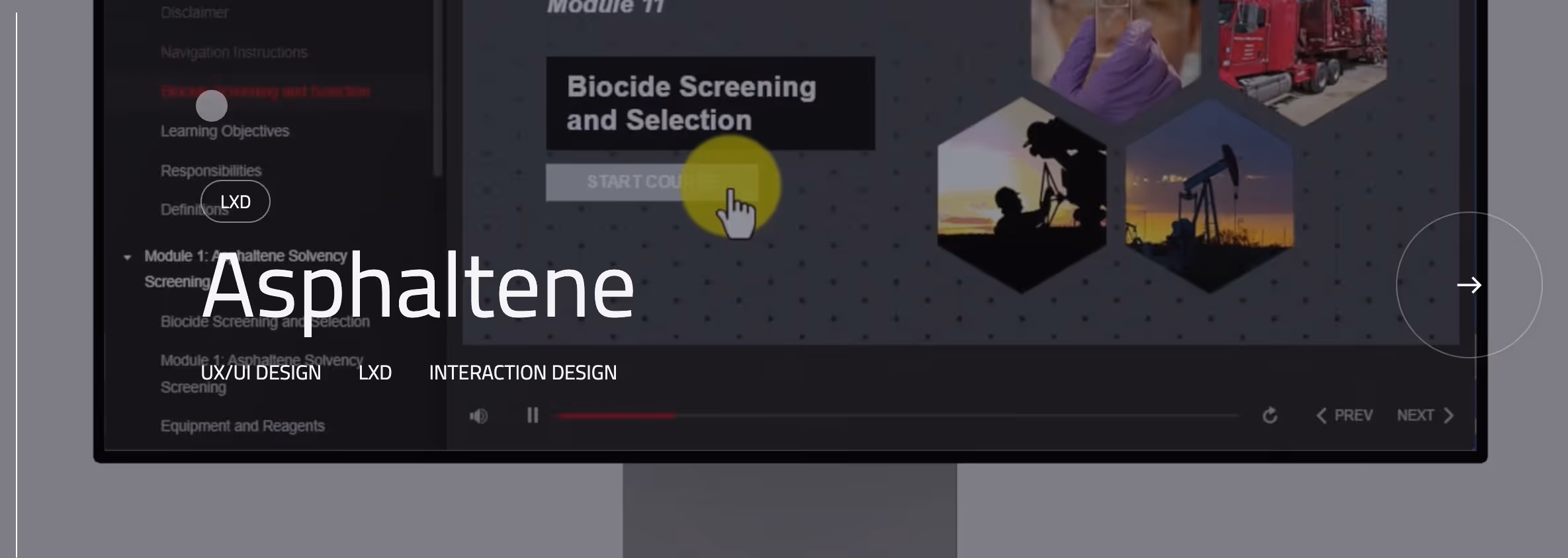
Guia de estilo/ componentes
Links de conteúdo
Botões
Os botões sinalizam a ação. Sua hierarquia deve ser óbvia à primeira vista.
As ações primárias são raras. As ações secundárias são solidárias.
Link pequeno
Parte
Texto do botão
Editável
Texto do botão
Link pequeno pairou
Texto do botão
Link dos termos
Texto do botão
Link de termos pairado
Texto do botão
Formulários e entradas
Os formulários devem parecer fáceis. Reduza o atrito. Remova campos desnecessários.
Modais
Os modais interrompem o fluxo. Use-os com moderação e intencionalmente.
Cartões
Os cartões agrupam as informações de forma lógica. Eles nunca devem parecer decorativos.


Se você é recrutador ou gerente de contratação
Se você é um criador ou profissional de carreira
Baixe recursos gratuitos para subir de nível
Compre produtos digitais premium
Reserve uma sessão de mentoria

Se você é uma empresa que deseja colaborar
Saiba como faço consultoria sobre design, T&D e estratégia de IA
Agende uma chamada de descoberta ou envie um resumo


.avif)
.avif)
Etiquetas/Chips
As tags fornecem contexto, não decoração.