Style guide / layout


Breakpoints & Responsiveness
Layouts must adapt logically across devices. No custom hacks per screen size.
Design once. Scale intelligently.
Spacing & Sizing Scale
Spacing follows a defined scale. Random spacing is a visual liability.
Consistency compounds quality.
Alignment & Margins
Alignment communicates discipline. Margins are intentional, not accidental.
Alignment mainly stays left starting, but under certain situations will conform to center. Those situations are for larger section headings that correlate to some sort of visual element like a video or a grid of images.
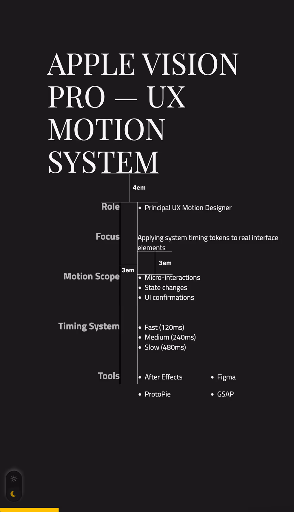
This website uses both REM and EM in respects to margins.
REM is mainly used for consistent spacing of side margins or for elements that don't need very dynamic scaling. While most typographical elements use EM to have spacing that is consistent to the font size of those elements without a lot of custom sizing rules.